Korporea
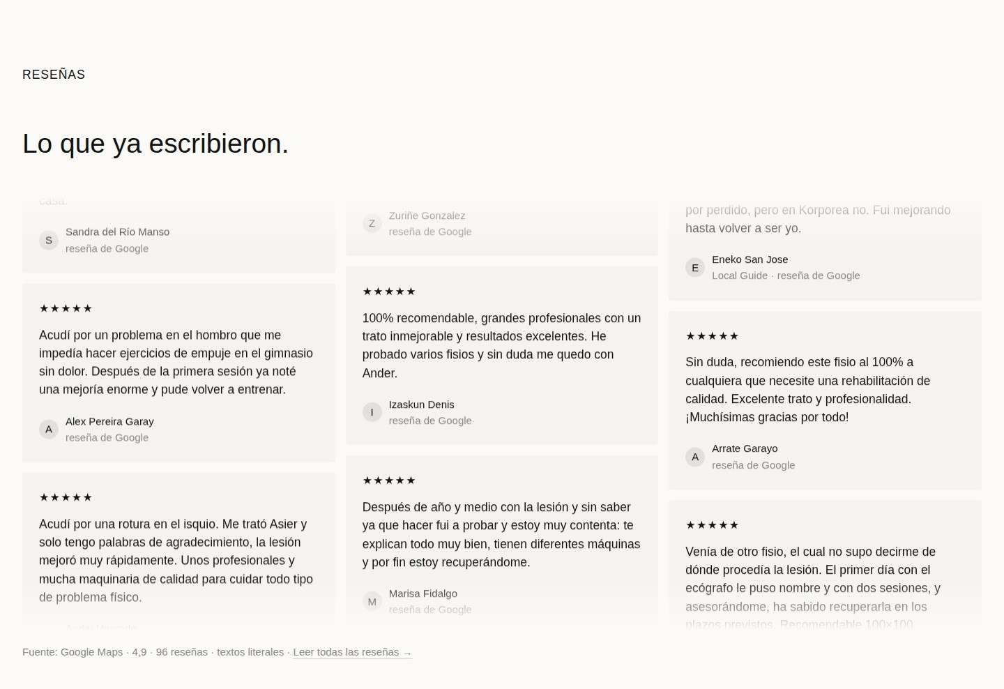
A physiotherapy clinic rated 4.9 on Google — and a website that never shows it. A concept that puts the patient's path above the machine list.
View live site- Category
- Healthcare
- Role
- UX/UI design, research, copywriting
- Timeline
- 3 weeks
- Year
- 2026
A working clinic, a silent website
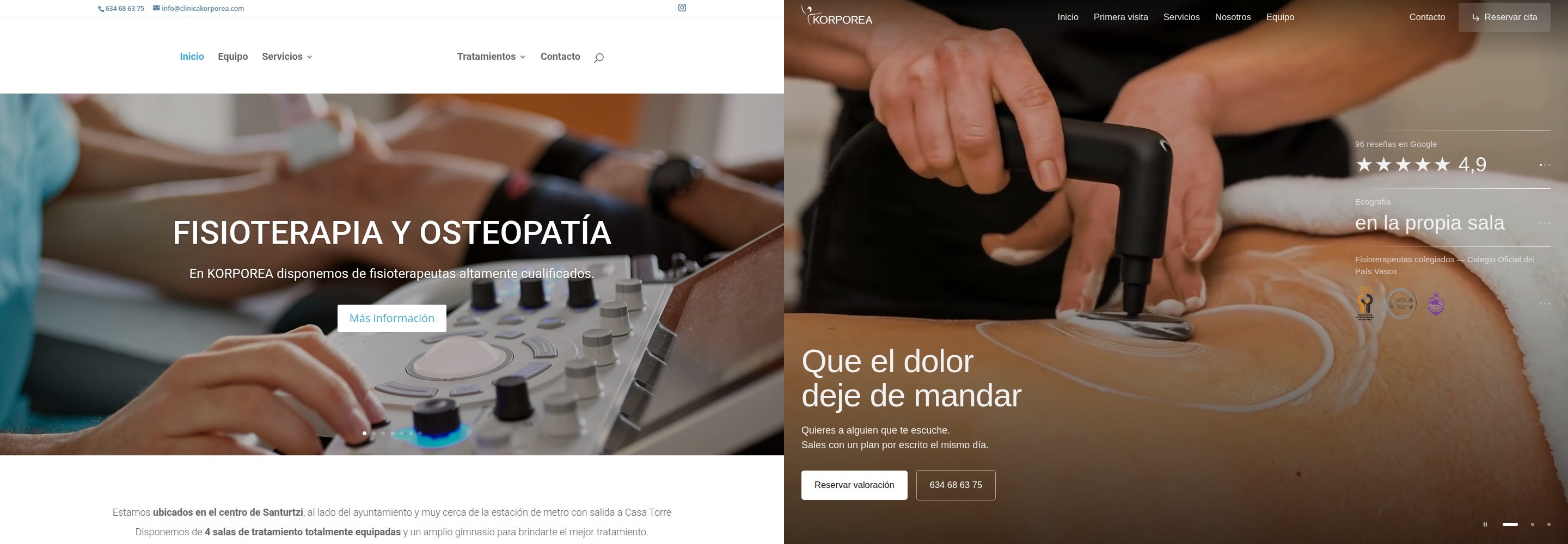
Clínica Korporea is a physiotherapy and osteopathy clinic in Santurtzi with a 4.9 rating from 96 Google reviews — a number its 2022 WordPress/Elementor site never shows. The pages speak the language of machines: ECOGRAFÍA, EPI, SUPER INDUCTIVA ZIMMER in caps, while a new patient arrives asking about their own pain.
That site was made as a digital business card for people who already know what they want. It doesn't answer a single question of a first-time patient — and answering those questions is exactly what a local clinic's site is for.
Before any pixels, we answered the question everything else depends on: how does a patient from Santurtzi actually choose a clinic? Research across local Spanish clinics points to a three-step decision — is this my problem, can I trust these people, can I book without a phone call. The old site answered zero of three: no team, no process, no honest booking channel — six identical CTA widgets instead.
The brief, in one line: turn the list of machines into a patient path — and let the 4.9 rating do the talking.
¿Pueden ayudarme? ¿Quién me tratará? ¿Cómo reservo sin llamar?
Decisions with evidence, not taste
- Live audit first: the whole old site was taken apart section by section before a single pixel moved — headline sizes, CTA repetitions, what the rating was and where it hid.
- Three personas from research — Ainhoa (trust and trato), Jon (techniques and slots), Miren (fear of the unknown) — each with her own route through the site.
- Five questions rule: the site must answer ¿Pueden ayudarme? ¿Quién me tratará? ¿Cuánto cuesta? ¿Dónde y cuándo? ¿Cómo reservo? — without a single phone call.
- One page per symptom: the showcase one-pager became 13 static pages — «bruxismo Santurtzi» or «tendinopatía» lands on its own page, not on a hero slider.
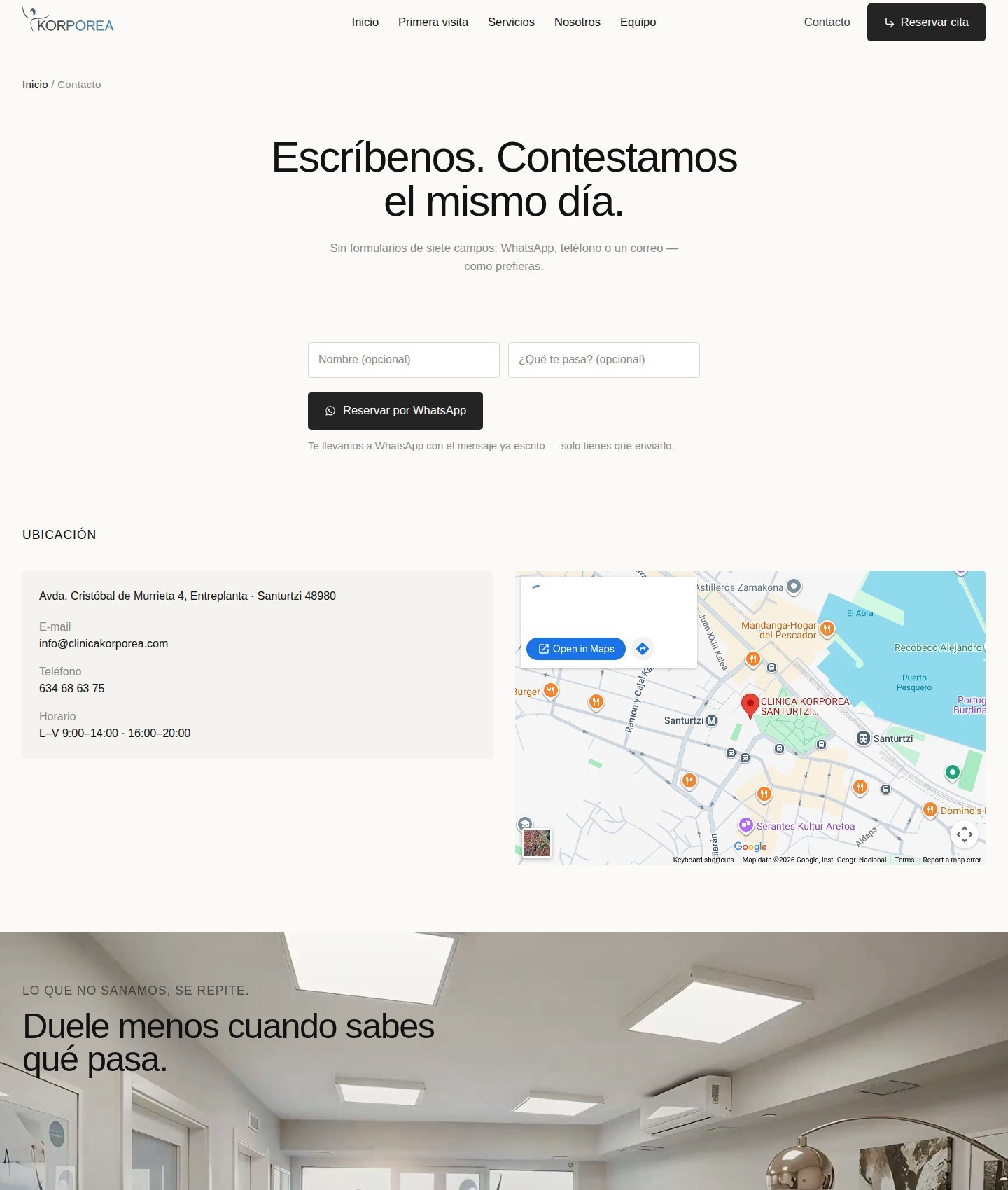
- Honest content only: the real rating, the real opening hours, one booking channel — the one the clinic actually answers: WhatsApp.
solution?
I did —
01/03
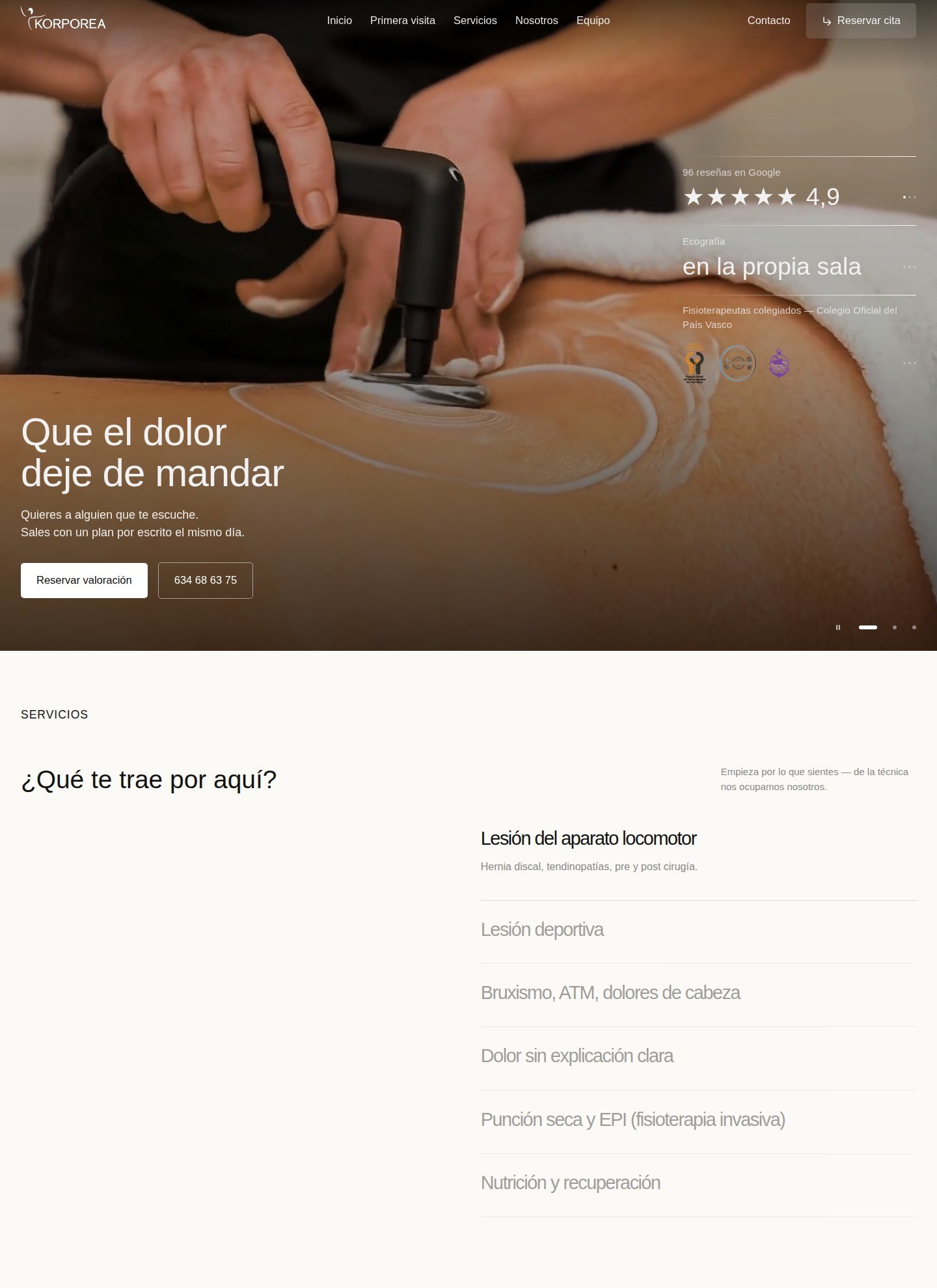
The first screen answers «can I trust them?»
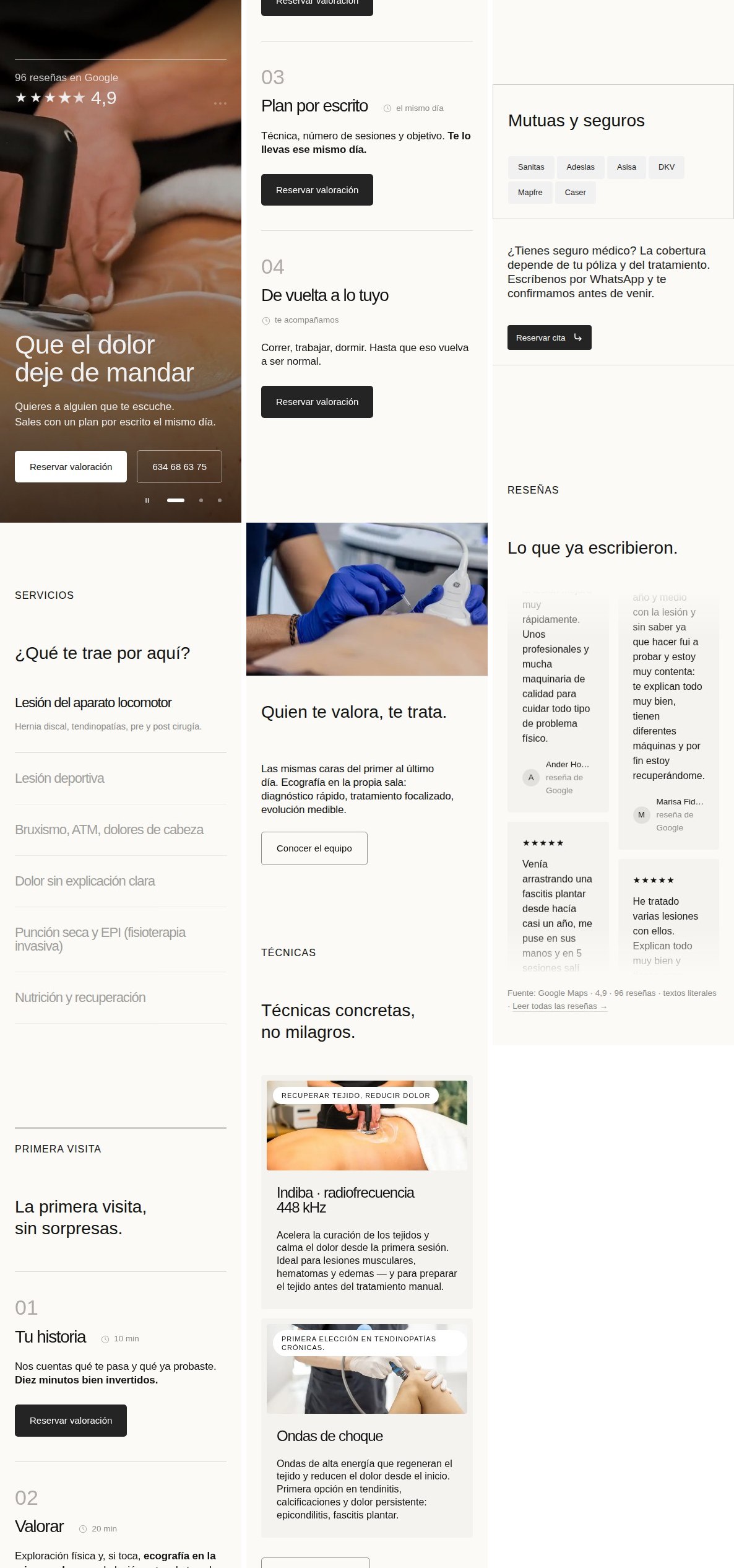
Full-bleed video, the 4.9 rating with its source in the same visual zone as the CTA, the colegiada proof strip and «en la propia sala» as concrete promises — one CTA per screen, pointing to WhatsApp, the channel the clinic really checks.
02/03
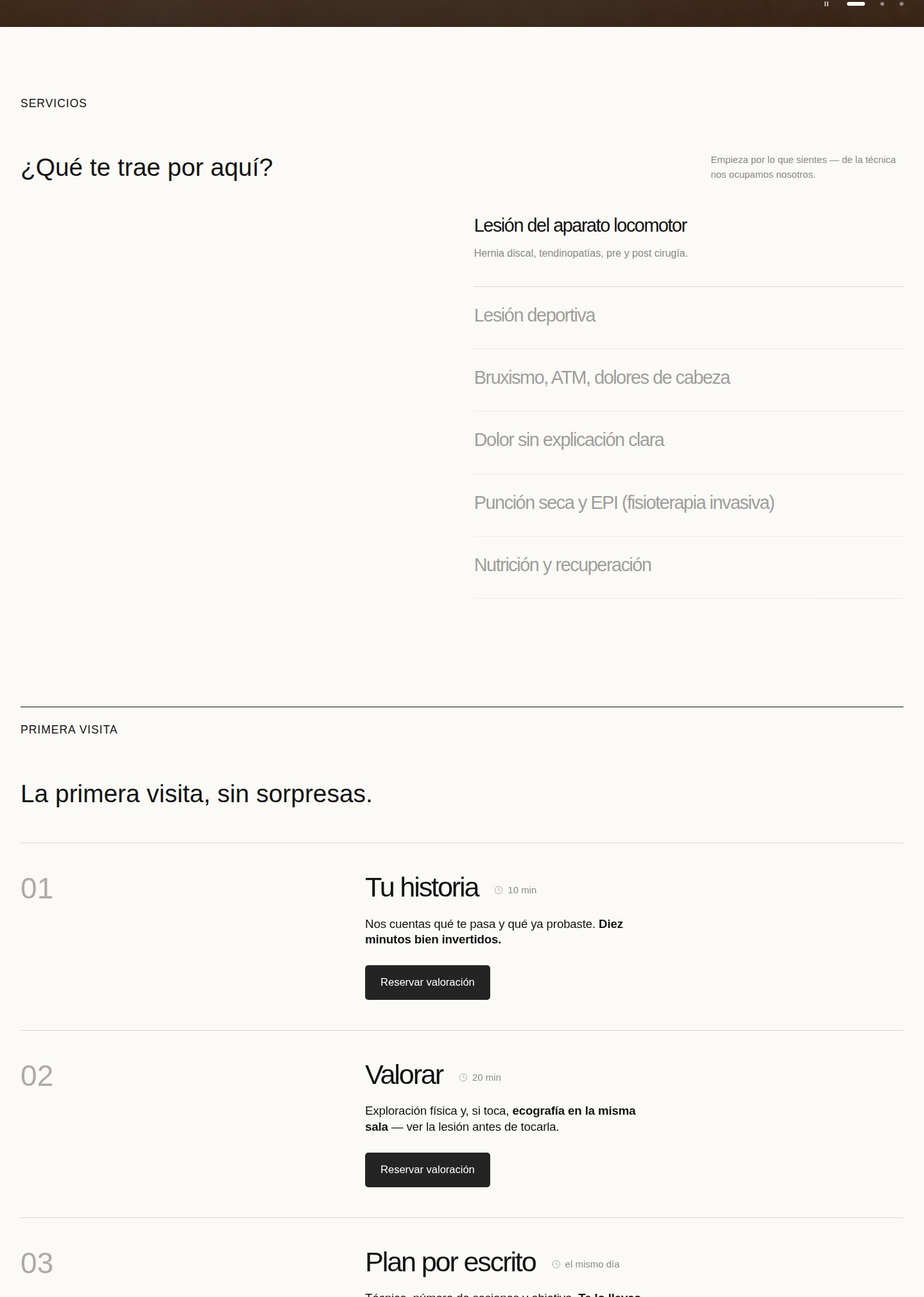
La primera visita, sin sorpresas
The 01→04 route spells out the durations, the ecografía in the same room and a written plan the same day — the unknown, the main fear of a first visit, taken off the table before it is asked.
03/03
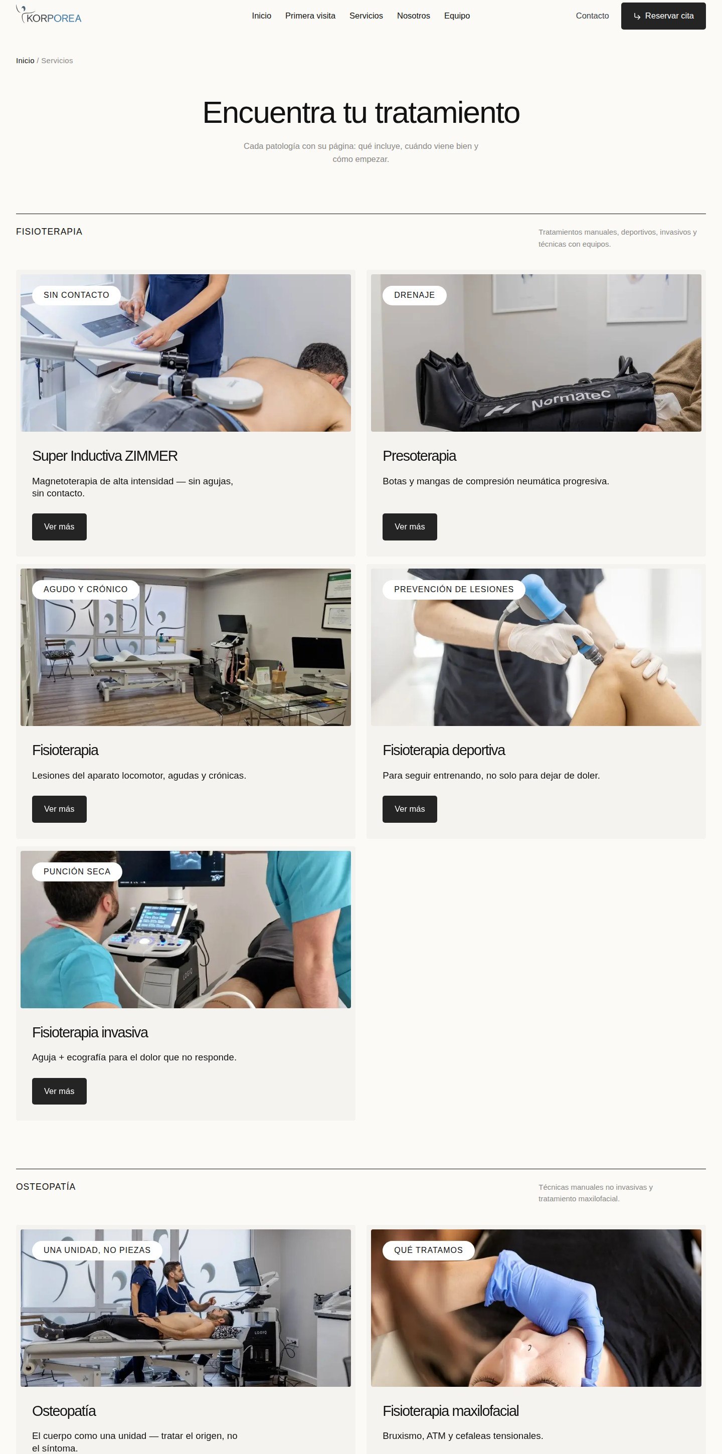
A full site, not a landing
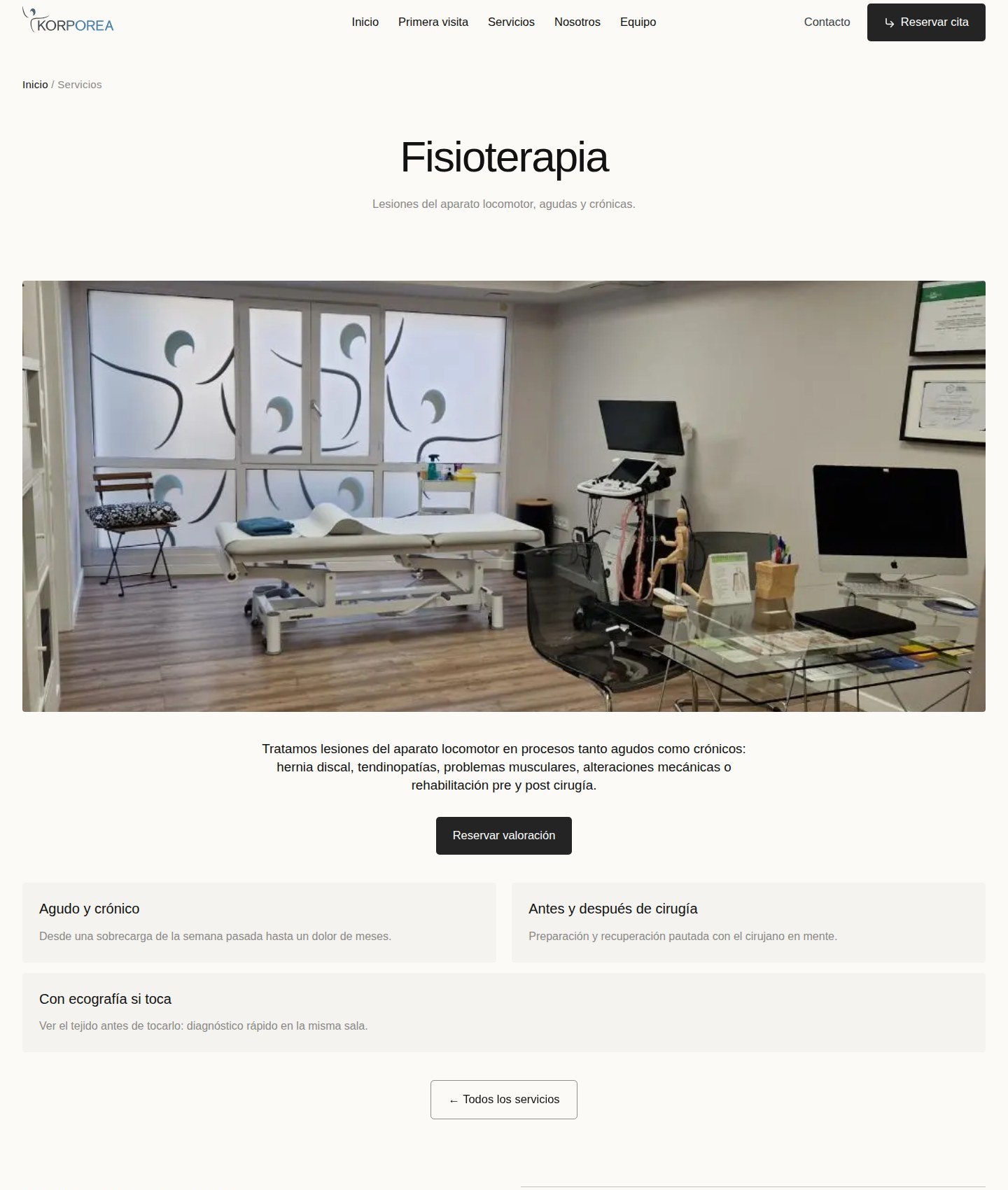
Grouped into patient language (fisioterapia, osteopatía, técnica, nutrición), each of the treatments gets its own page with photo, process and price-framing FAQ. Built in Next.js, static export — fast against an Elementor site with plugin weight.
Distance you can see in one glance
The concept went live as a pitch asset: the before/after on the cover shows the distance in one glance, and the live demo carries the whole argument. Everything on it is real — the rating, the colegiada approval, the team, the clinic photos.
Lighthouse 100/100 on accessibility and best practices, 89 performance, static export. The concept doubles as a working demo of exactly the structure the clinic could take to its own domain — the offer behind the pitch.
More screens
Want a site like this with an AI assistant?
See the packages