DIMORDAI
A full EdTech product redesign — design system, 50+ screens, 6 states each, built for a 13-person team to ship
- Category
- EdTech
- Role
- UX/UI Design, Design System
- Timeline
- 8 months
- Year
- 2026
Background
An EdTech platform that needed to start from zero
DIMORDAI is a learning platform for high-school students and their parents, built by a startup in Armenia. Courses, live lessons, homework, tests, an AI tutor, referrals, and payments — all in one product
When I joined, the existing design simply wasn't working. The co-founder brought in two designers — me and Lina — to rebuild everything from scratch. A 13-person team spread across time zones: two designers, six developers, a product manager, the co-founder, and a CTO
Problem
The old design was too simple to ship. Six developers were waiting on mockups, and there was no design system — every screen required guesswork from the team
The team needed a full redesign. Not prettier screens, but a system developers could build from without asking questions about every component. And they needed it fast: the startup was preparing for Yandex's accelerator application
How do you design 50+ screens without slowing down 6 developers?
Approach
System first, screens second
- Design system first — Tailwind-based, with full specs. Every component documented before a single screen used it
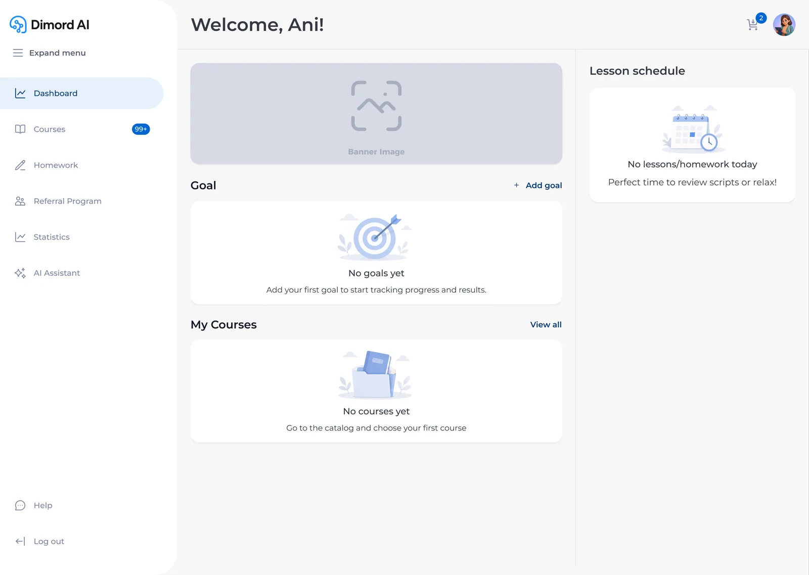
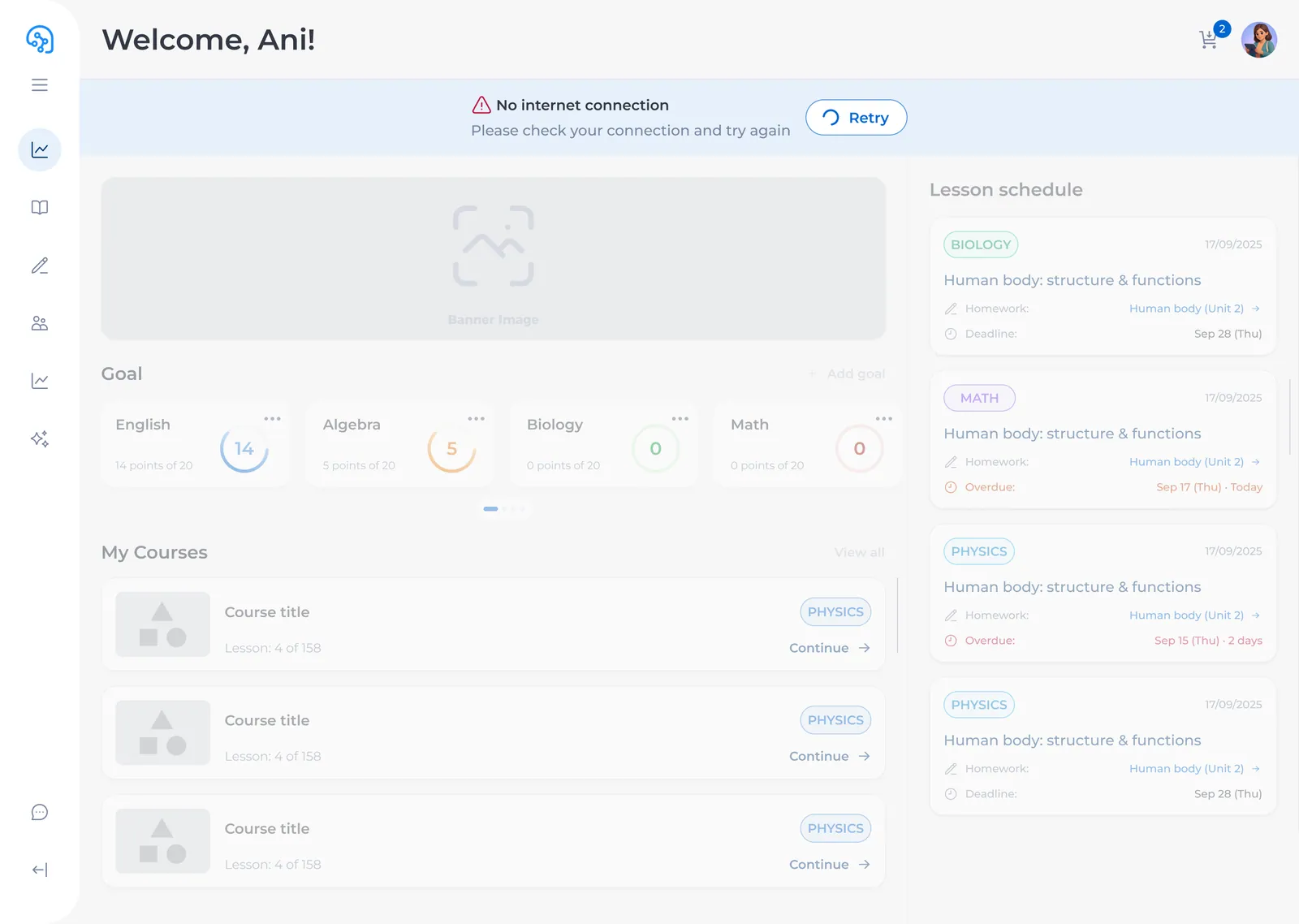
- States, not just happy paths — every screen with loading, empty, error, and skeleton states. The dashboard alone had 6 states; the AI assistant had 4 states × desktop and mobile
- Responsive from day one — desktop (1440), tablet (768), mobile (375) for every key screen
- Two designers, one system — I worked alongside Lina, splitting screens by area. We reviewed each other's work before anything went to the team
- Weekly sync with developers — every Friday, a 30-minute review. They'd spot constraints I hadn't seen; I'd spot interactions they hadn't considered. Issues caught before they reached code
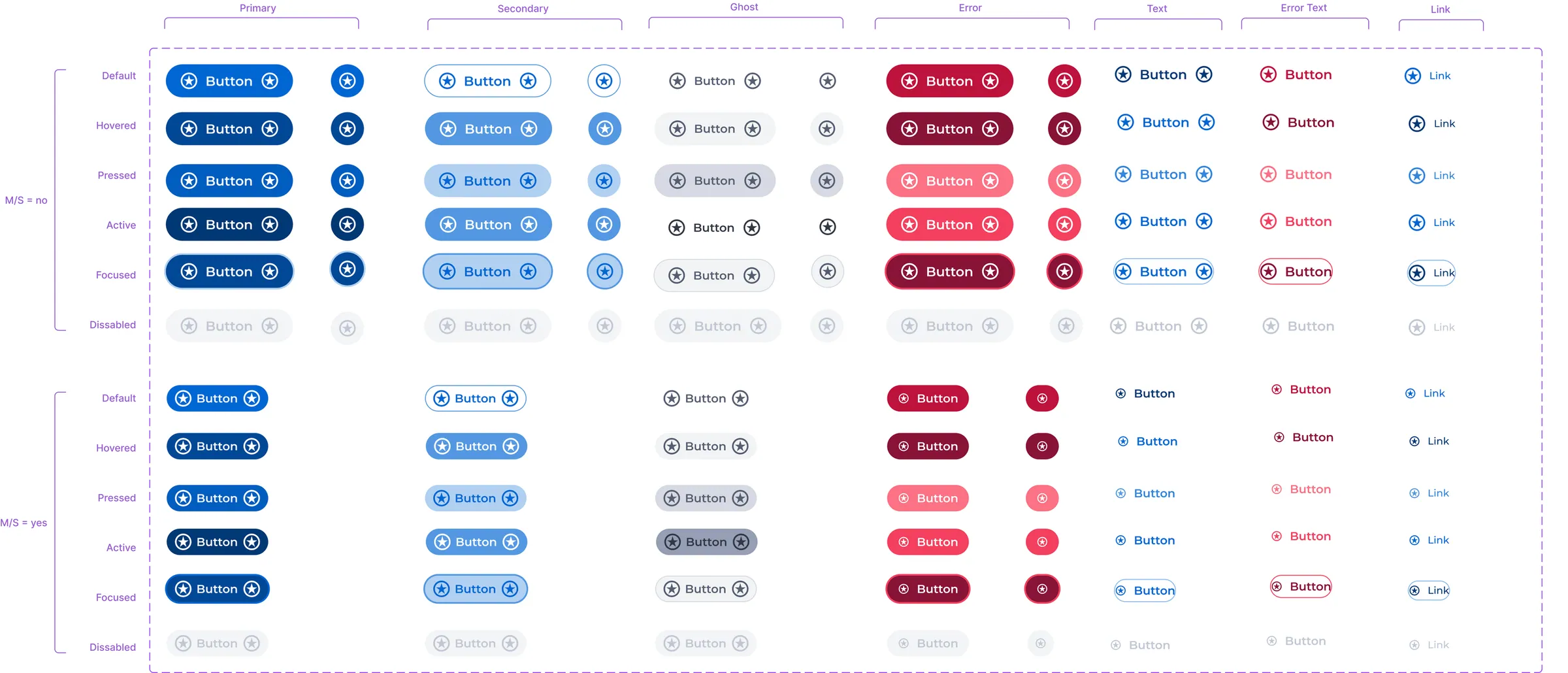
- 30+ component pages — buttons with 15 variants, inputs with 6 states, chips, dialogs, dropdowns, tables, sidebar, progress bars. Every component documented for handoff
solution?
I did —
Solution
01/06
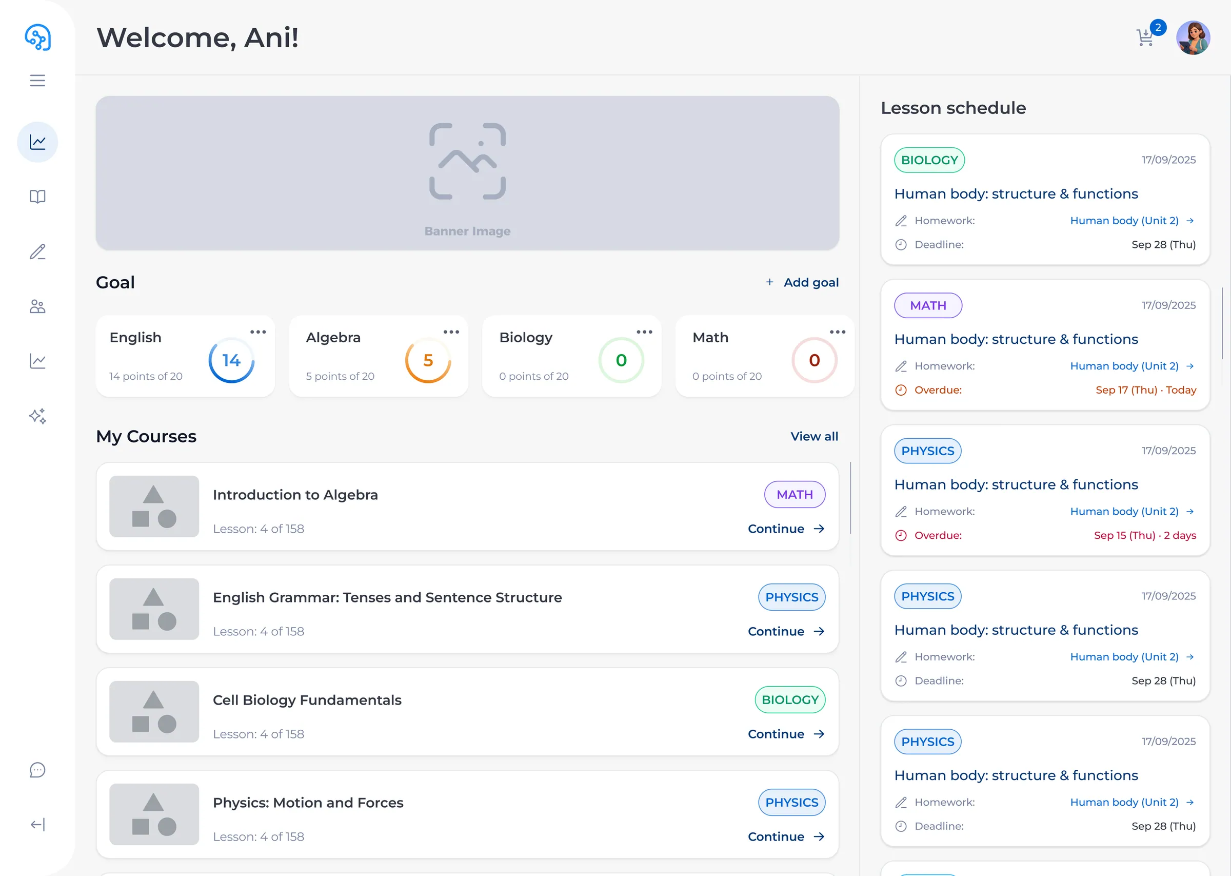
A dashboard that shows what matters
The main screen greets the student by name, shows goal progress in each subject, lists active courses with next-lesson links, and schedules upcoming lessons. Goal cards use circular progress — the student sees at a glance where they need to catch up. The right column flags overdue homework in red so nothing slips through
Solution
02/06
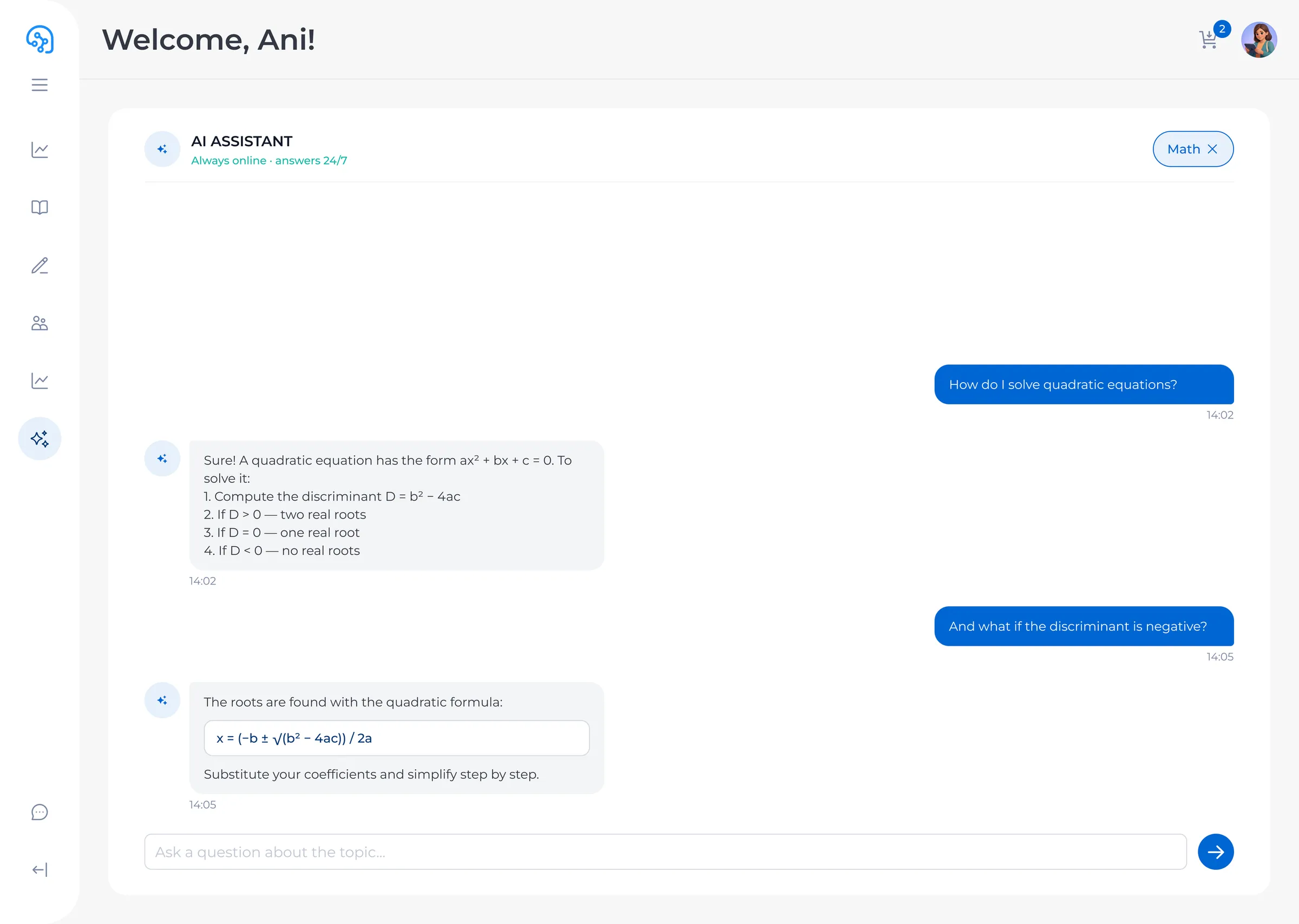
An AI tutor that teaches, not just answers
Students pick a subject — Math, Physics, English — and ask questions in natural language. The AI walks the student to the answer with step-by-step explanations. The interface shows conversation history and adapts to the student's level. Parents can see what their child is working on
Solution
03/06
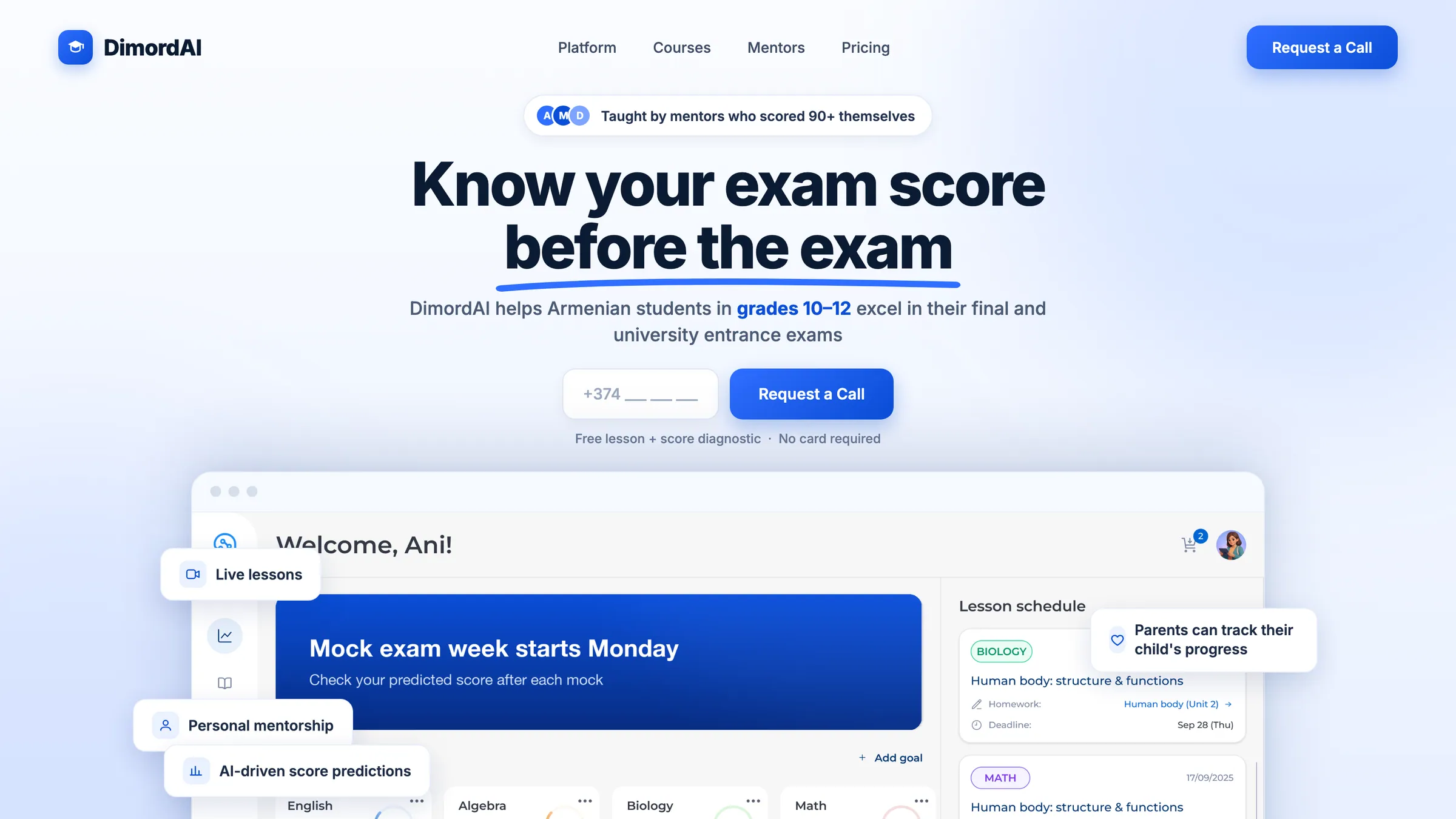
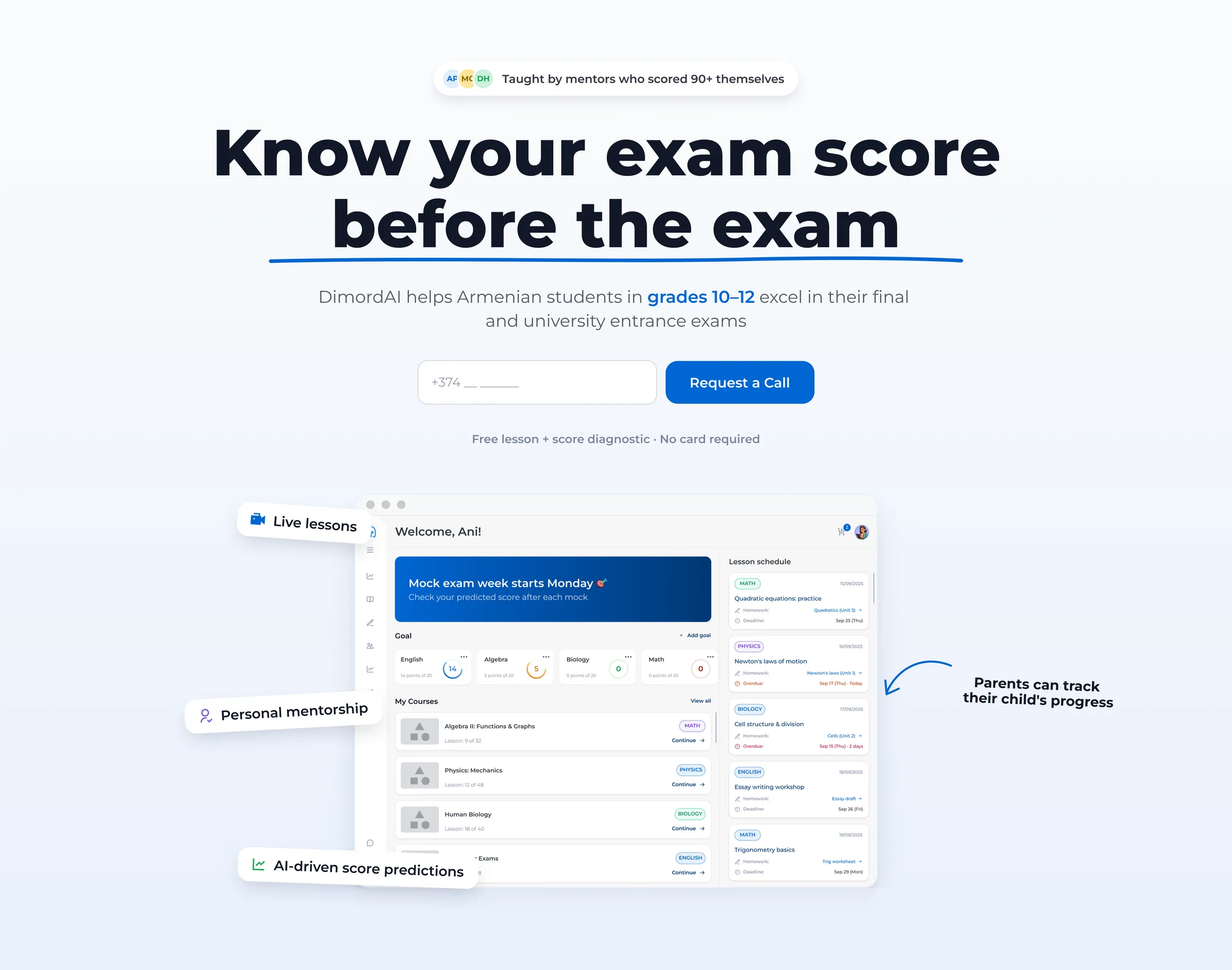
A landing page built for conversion
The landing doesn't describe features — it shows them. A live dashboard preview demonstrates the platform in action. Call-to-action is a phone number input with a free diagnostic offer, no card required. Feature bubbles around the mockup highlight the key value props: live lessons, personal mentorship, AI-driven score predictions
Solution
04/06
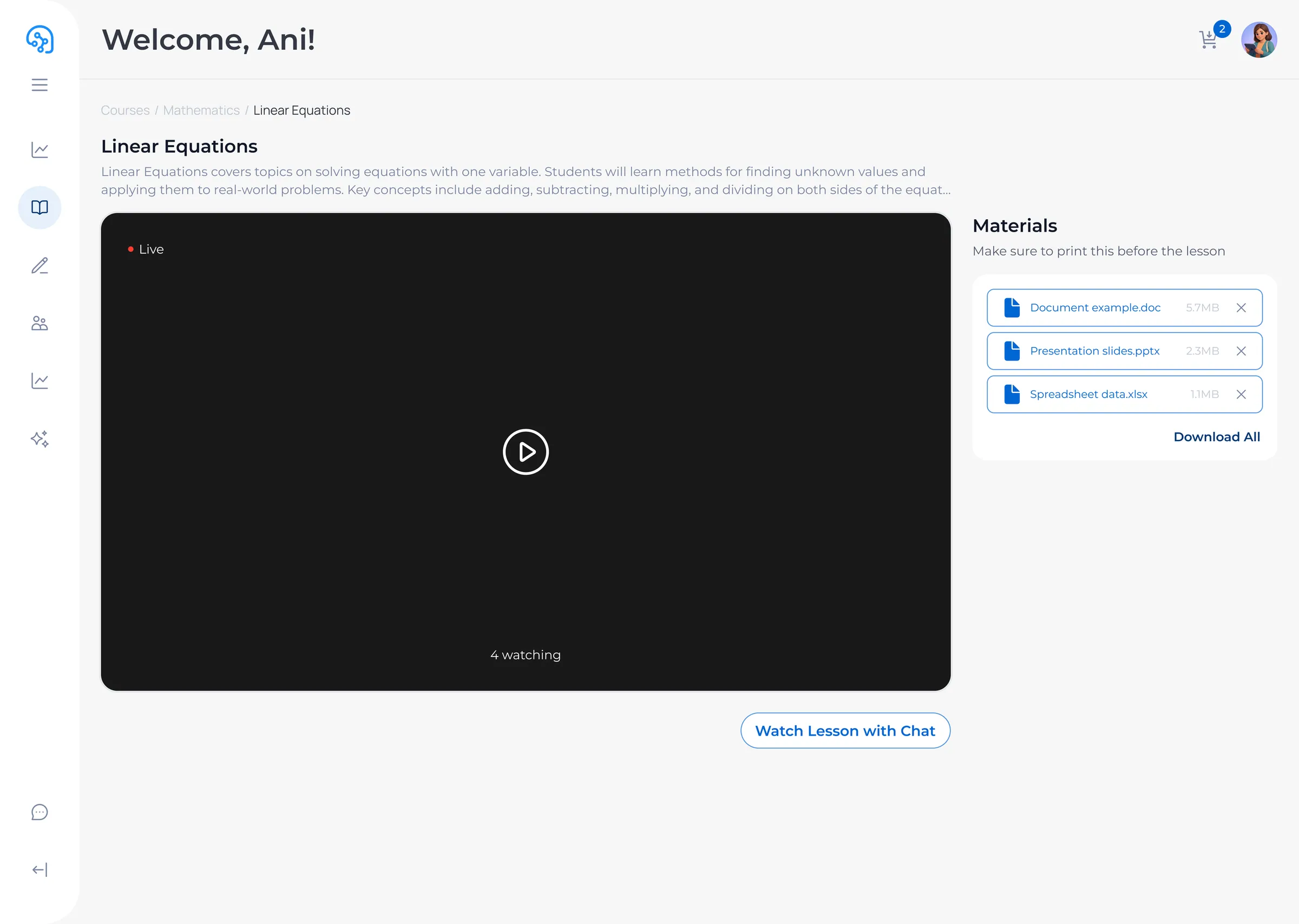
Live lesson with real-time chat
Course Hub shows the lesson in live state — video player with a ·Live badge, lesson description, downloadable materials, and a sidebar chat where students interact during class. The player adapts to fullscreen and mobile, with 4+ watching live. Materials pre-load the worksheet, slides, and spreadsheet so the student can follow along
Solution
05/06
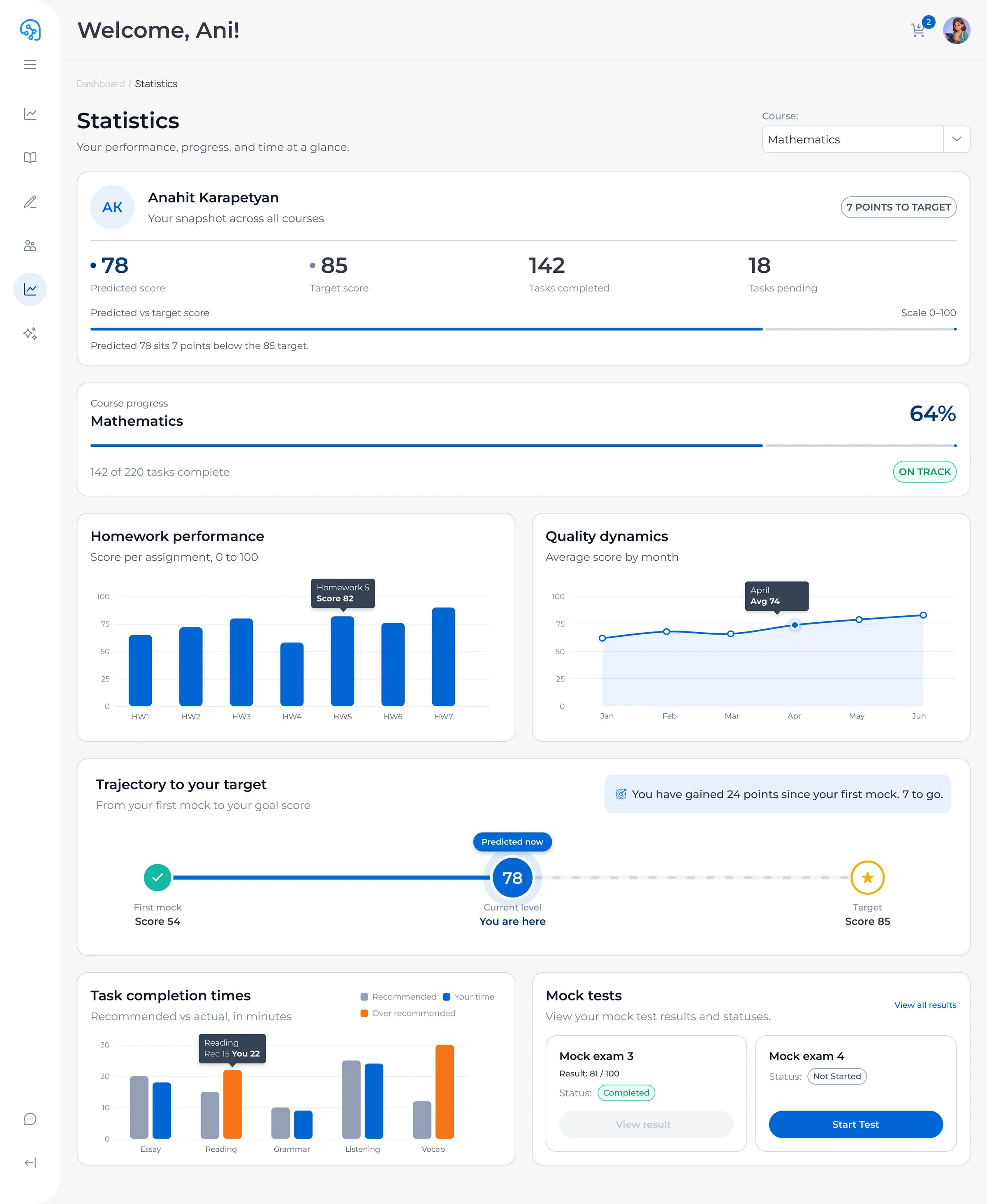
Data-driven progress tracking
The Statistics dashboard gives students and parents a full view of academic performance — predicted vs target scores, course progress bars, study trajectory, and weekly trends. Multiple chart widgets break down performance by subject, time, and goal proximity. Designed to answer one question: «am I on track?» at a single glance
Solution
06/06
A component library, built from scratch
The design system has 30+ component pages — buttons (15 variants across 3 sizes), text inputs with every state (empty, filled, error, disabled, focus), chips and tags, badges and counters, dialog windows, dropdowns, progress bars, sidebars, tables, and more. Each component is marked «ready for development». The DS follows a 3-tier token architecture: Primitive colors Semantic tokens Component tokens, with Tailwind-based spacing and typography
Resultsend
From legacy design to investor-ready product in 8 months
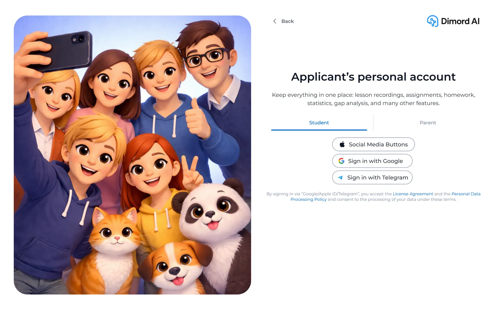
Over 8 months I designed 50+ sections: dashboard with goals and courses, course hub with live lessons and homework in 5 states, AI assistant with subject-specific tutoring, authentication with separate student and parent flows, referral program, statistics, payments, question bank, and a landing page
Design handed off to the frontend team. The startup got into Yandex's accelerator and pitched to investors. Sales launch followed, with payment integration already in progress. The design system became the foundation every developer worked from
Edge cases and entry points

Want a site like this with an AI assistant?
See the packages