Brightly Studio
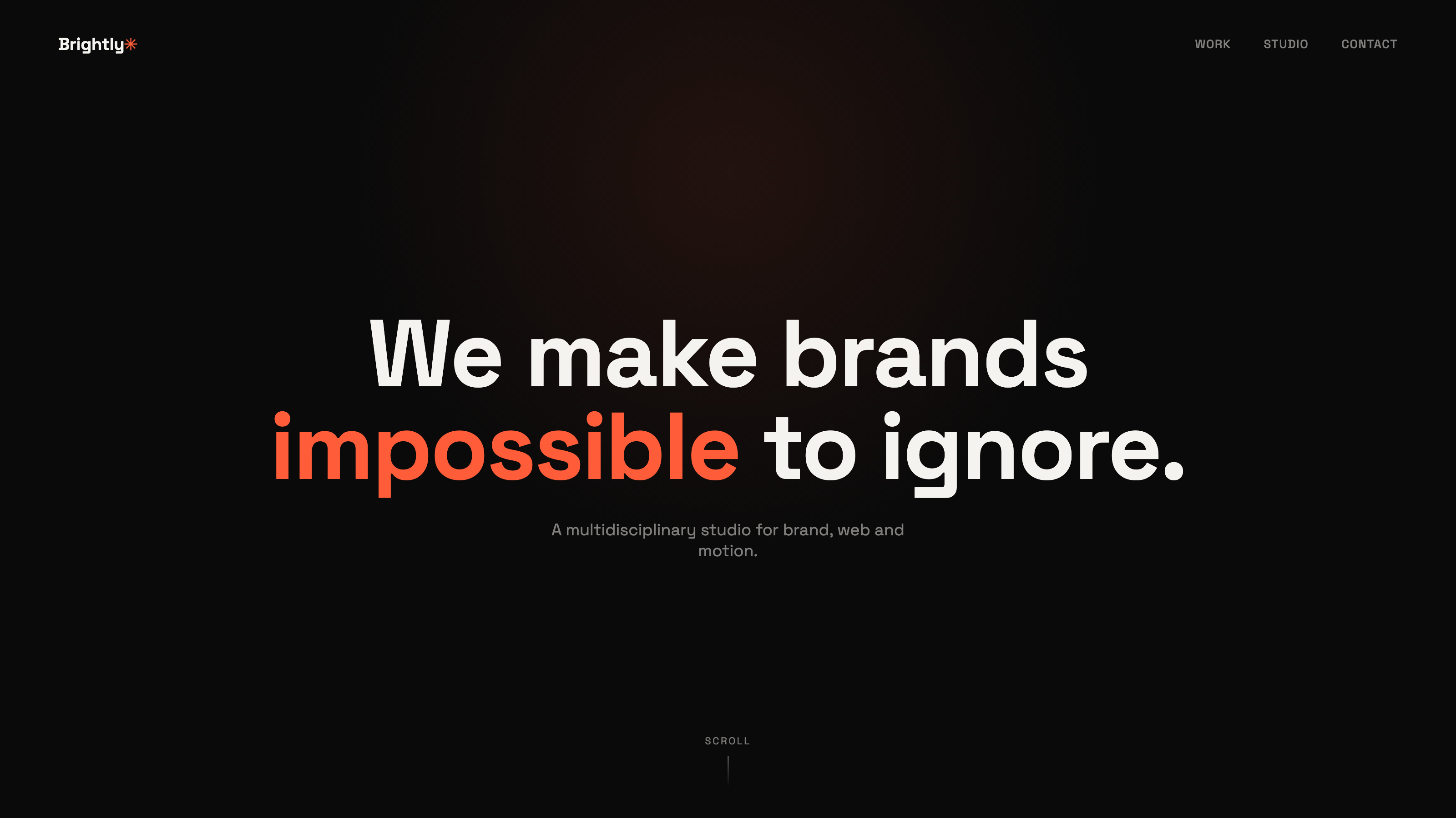
A bold yet minimal portfolio site that highlights selected work and clearly communicates the studio’s creative direction
- Category
- Creative Studio
- Year
- 2026
Background
Showcasing creative work without unnecessary noise
Brightly Studio needed a portfolio website that could showcase their creative work while clearly communicating their positioning as a multidisciplinary design studio. Their previous site felt cluttered and didn’t reflect the quality of their projects
The main challenge was to balance visual expression with clarity. The studio wanted their work to stand out, while still guiding visitors through their services and approach in a structured way
Problem
The old site tried to sell the studio on every scroll — taglines, awards, process diagrams — before a single project image loaded. By the time work showed up, most visitors had already formed an opinion without seeing any of it
For a studio that lives and dies by its visual work, that's backwards: the portfolio was competing with the very thing it existed to show
So how loud can a portfolio get before the work goes quiet?
Approach
Let the grid do the pitching
- One line of navigation, one huge headline, then straight into the work — no scroll-jacking intro sequence
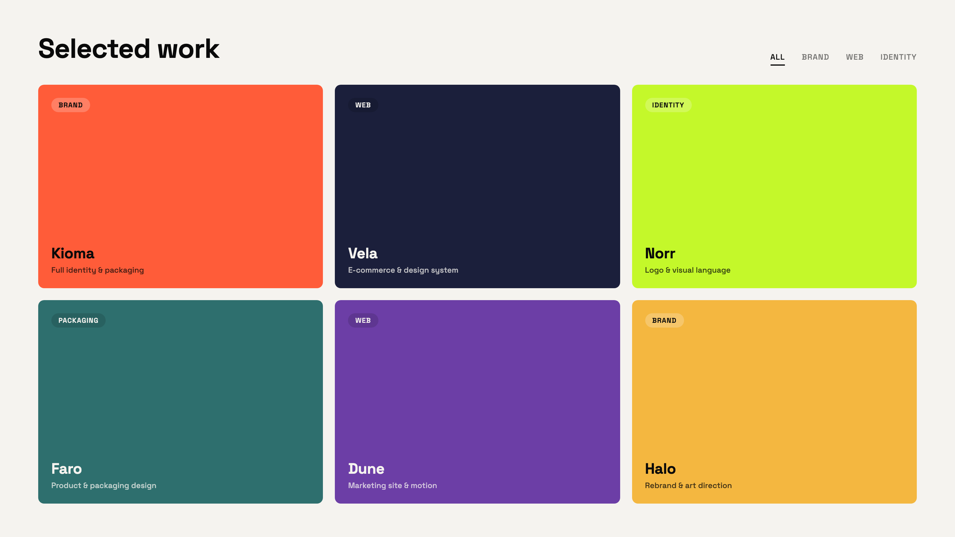
- A bold color grid instead of photography-heavy thumbnails — every project reads at a glance, even before the case loads
- Two lines of copy per project, maximum — the studio explains itself through range, not paragraphs
- Coral as the one accent color, used only where it matters — a word, a tag, never the whole page
Resultsend
A focused portfolio that lets the work speak
I gave the site a minimal structure so the work could carry the page — bold visuals, short captions, no filler between projects. Each section gets room to breathe without losing pace
Six projects, four categories, one grid — the intro dropped from taglines and awards to a single headline before the first image loads. Framer let me build transitions that feel alive without competing with the content. The layout disappears — the work does the talking
Want a site like this with an AI assistant?
See the packages